
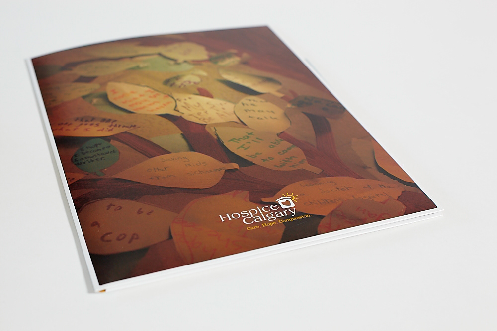
Hospice Calgary capital fundraising campaign. Goal: raising $7 million to help them purchase their own building and create a support centre for families going through the loss of a loved one. The cover photo was taken during a visit of their centre. All the leaves on the wall have personal messages from kids to the parent they have lost. Messages of grief, of hope, of what they want their lives to be, of things they haven't had a chance to say or do together. (Photo of the folder by Ellen Kirkpatrick)
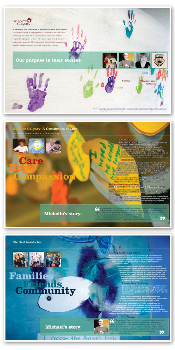
Inside pages of the Hospice Calgary brochure. All large photos were taken by yours truly, beside the portraits.
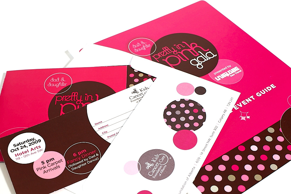
Invite, brochure, envelope, ads, ticket, even guide, signage, etc, for a fundraising event for Kids Cancer Care Foundation of Alberta, in Calgary. "Dad and Daughter" Gala, with the theme of "Pretty in Pink"! Dads wore pink ties and salmon shirts, while all the girls were barbie dolls all decked out in pink satin!
First year for this all-ages event hosted at Hotel Arts, and it raised over $30,000 for post secondary scholarships designed to help child cancer survivors, and give them a boost for their delayed dream careers.
Paparazzis were "de rigueur", of course!
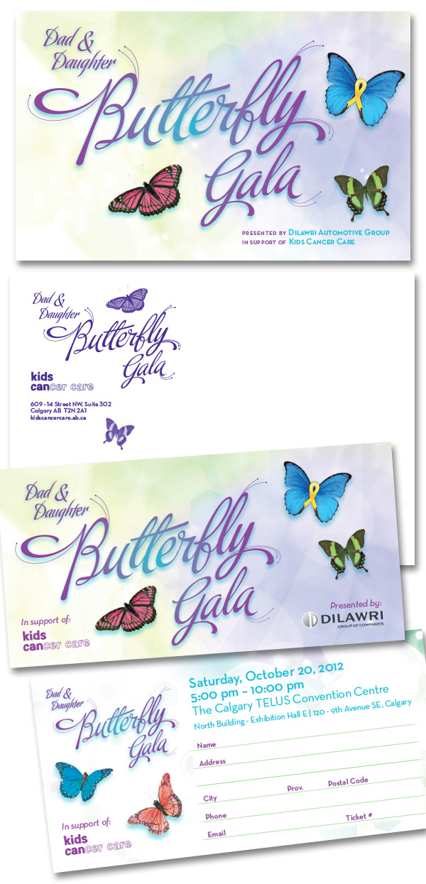
KCCFA Dad & Daughter Gala. Third edition for 2012. Sold out in less than 8 minutes!
Invite, matching envelope, ticket, program, signage... the whole 9 yards!
Typeface from Sudtipos, and a LOT of BUTTERFLIES!...
Invite, matching envelope, ticket, program, signage... the whole 9 yards!
Typeface from Sudtipos, and a LOT of BUTTERFLIES!...
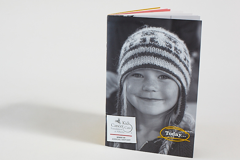
Kids Cancer Care Foundation of Alberta - Annual Report 2009-2010. Today and tomorrow was the theme of this report, showcasing what KCCFA does for the kids, how it invests its money into summer camps, cancer research, clinical support, but also scholarships, and volunteer programs.
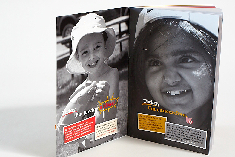
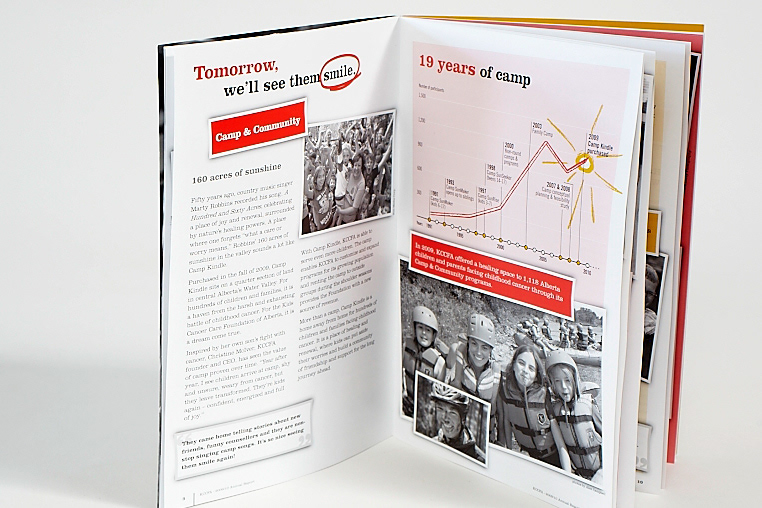
3 colour print, 6"x9" only, and it packed an emotional punch!
Lots of handmade "doodles", collage and black and white pictures of kids with cancer having fun, and being kids again.

For KCCFA 2010-2011 annual report, theidea was to push the emotional grab further, as well as introducingtheir new identity (designed by Karo).
The tagline, and subsequent'chapters' were all based on their logo. The "you can" has many legsthat I took advantage of in this AR. Typeface designed by yours trulywith Fontographer, based on the new logo.
The tagline, and subsequent'chapters' were all based on their logo. The "you can" has many legsthat I took advantage of in this AR. Typeface designed by yours trulywith Fontographer, based on the new logo.

The 2012 KCCFA annual report had many challenges. 1st: make it better than the previous year. 2nd: make it the same.
With that in mind, this project was a bit of a collaboration with Gary Blaney and the KCCFA team.
Wonderful photos from their image bank and special photoshoots made this AR compelling on both a visual and a readers' level. The tagline was eventually used in a series of ads (see advertising section) for their High Hopes Challenge campaign.
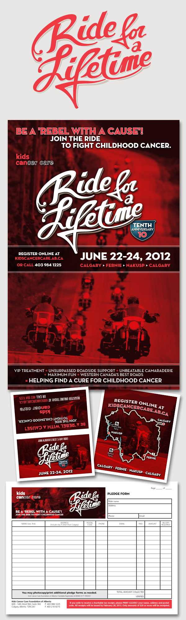
Some of the promo materials I created for the 2012 Ride for a Lifetime. Starting from the top: new logo, poster, double folded business card with route map and the registration kit (sample pledge form page). The whole package screams 'biker', yet it is sophisticated, bright and cheery!
I've taken part to this year's Ride and raised over $1200! Yay!
I've taken part to this year's Ride and raised over $1200! Yay!

The Kids Cancer Care Foundation of Alberta approached me to create an elegant package for their 2012 Parents' Quest for the Cure Gala. An invite with envelope, ticket, poster, 8'x8' sponsor banner, event signage and even a Powerpoint have been created with a cohesive branding in mind.
"A night under the Tzars" was the theme, and with nothing to work with nor from, using the obvious St Petersburg Cathedral came to mind. It is the quintessential Russian image, whereas the custom-made type had enough western-influenced swooshes to shake a stick at. The "Tzars" had to emulate a constellation of course.
"A night under the Tzars" was the theme, and with nothing to work with nor from, using the obvious St Petersburg Cathedral came to mind. It is the quintessential Russian image, whereas the custom-made type had enough western-influenced swooshes to shake a stick at. The "Tzars" had to emulate a constellation of course.
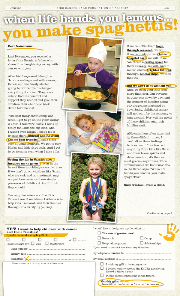
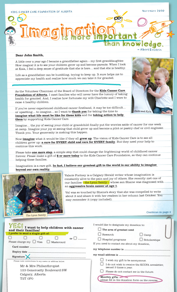
Another project for KCCFA: Direct Mail fundraising letters to previous donors, stakeholders and sponsors. The "spaghettis" letter was inspired by the picture of Sarah stuffing her face with spaghettis!.. The "Imagination" letter was a transitional design, as KCCFA introduced a new logo and brand in 2011 (desaigned by KARO).
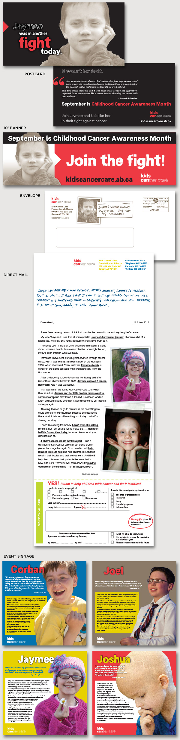
In September 2012, KCCFA ran a Childhood Cancer Awareness Month campaign, that included a 10' banner that hung over a bridge somewhere in Calgary, three postcards, a direct mail piece with matching envelope, and eight 2'x2' event signs featuring some of the kids that have battled, lost or still fighting cancer.
Very emotionally charged campaign, as Jaymee, featured on all materials, is battling her second cancer in seven years. Another kid featured on a sign, Stelios, never made it past the age of three...
Very emotionally charged campaign, as Jaymee, featured on all materials, is battling her second cancer in seven years. Another kid featured on a sign, Stelios, never made it past the age of three...
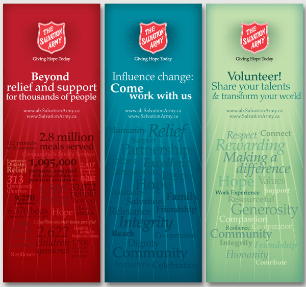
The Salvation Army approached us to create a series of pull-up banners that would distill what the "Sally Anne" represents to outsiders, potential volunteers and new recruits.
Entirely made in Adobe Illustrator, I plucked words from their annual report and the chairman's letter to come up with the taglines and the supporting text. The red panel being the "corporate" story, I defaulted to what the Salvation Army does in numbers. The stats speak for themselves.
The blue panel is the 'recruitment' messaging, and needed to be engaging at the core. Words chosen embody the mission each 'soldier' aims for.
The green panel is targeted for potential volunteers, and needed to be positive and light. The Salvation Army does not necessary resonate within all of us, but when associated with personal talents and the contribution each and everyone of us has to share, it makes ordinary people do amazing things.
"You must be the change you want to see in the world." –Gandhi
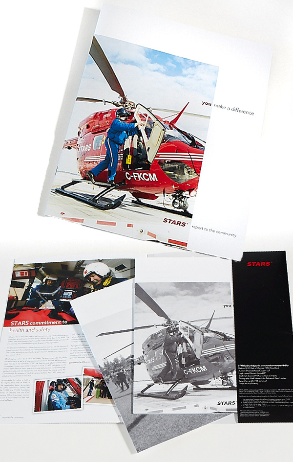
STARS air ambulance 2009 Report to the Community. Scrapbook-style, this 9x12 report is also a pocket folder that is versatile and can be used for various materials, including fundraising capital campaigns. STARS is a great organization, that has a lot of support in Alberta. The 2012 calendar is on its way, as well as the 2010 report.
And yes, I had the chance to go on a mission, to transport a heart patient from Three Hills to Calgary. Less than 7 minutes: the time it took from the moment the call was made to the Emergency Link Centre to take off... absolutely amazing life-saving service!
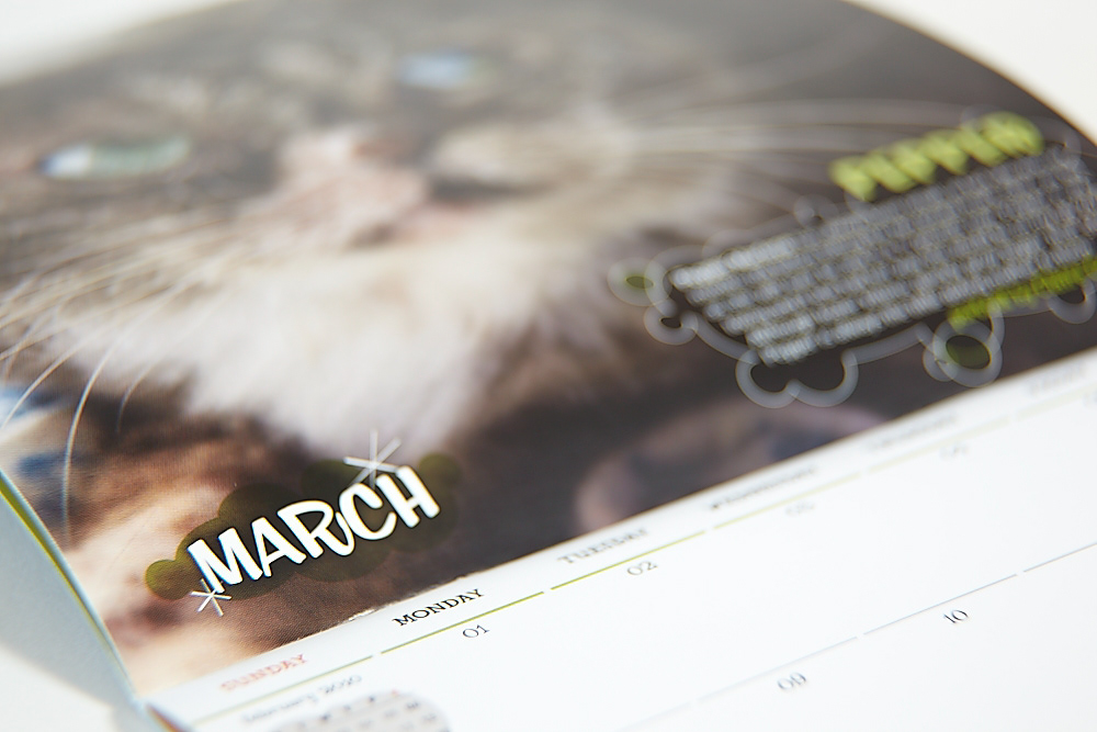
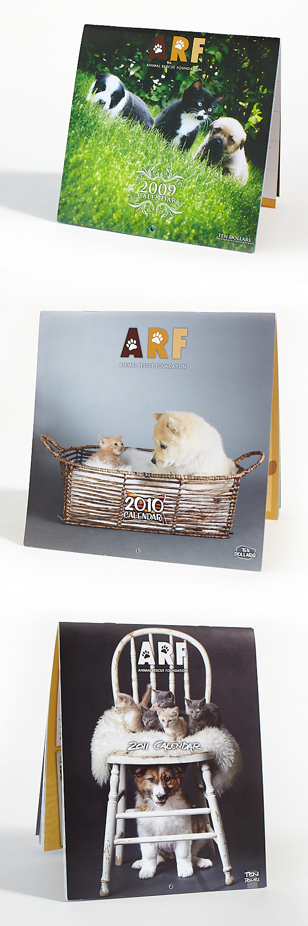
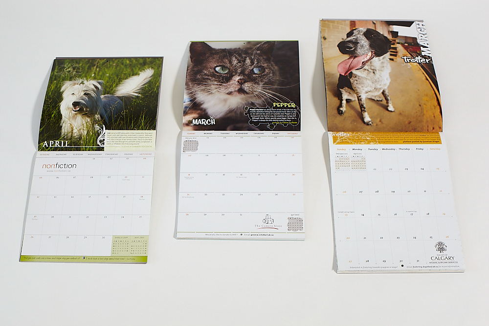
Many years of ARF (Animal Rescue Foundation) calendars. Featured here are the 2009, 2010 and 2011 calendars. Every year, I get a chance to work with great photographers, lovely pooches and kittens, and all the money raised goes to this organization that rescues abused and abandoned animals. ARF allows me to have a lot of fun on these calendars, and every year, I bring a new flavour to it, whether it is organic/floral, or a 50's diner feel. Awesome cause, fun project, great client. The 2012 calendar is in the works and will be a blast.
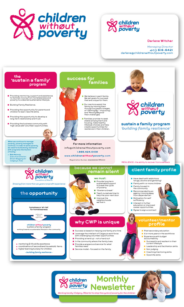
Children Without Poverty (not for profit org, based in Calgary, Alberta, Canada) - Identity, stationery, brochure, pocket folder, newsletter masthead and website. The whole communication package was articulated around fun, colourful images, all the kids wearing primary and bold colours. The font Grover was used for its bold, round and approachable design.