
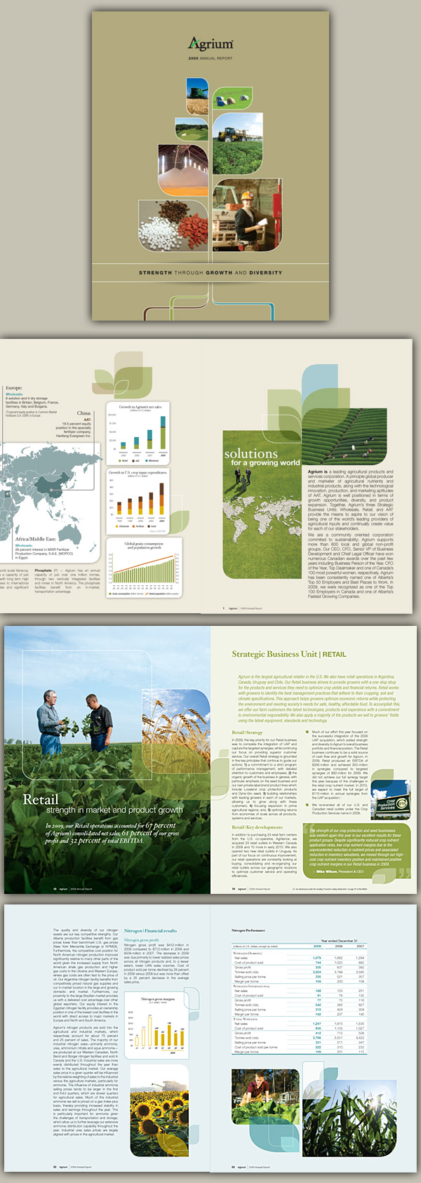
Agrium is a leading agricultural products. This multi-billion dollar company has over 10,000 employee and assets worldwide.
I had a chance to design and produce their 2009 annual report, from concept to production. It was a fun-filled project...
Front back and inside fold-out cover has a graphic that wraps around and leads the reader inside the book. Colour coding pages offer ease of navigation within this 140 pages behemoth report, and Agrium's three main Strategic Business Units: Retail, Wholesale and Advanced Technologies. http://www.agrium.com
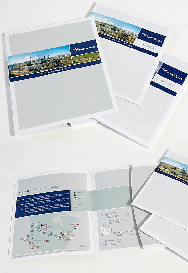
Fort Chicago is a leading energy producer and distributor with assets in pipelines, power generation (wind, co-gen, waste and hydro) and NGL storage. This 2009 Annual Report was their last, as the company change its name to VERESEN. http://www.veresseninc.com
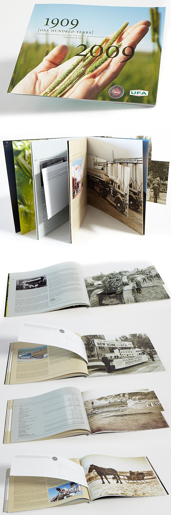
UFA (United Farmers of Alberta) 2009 Annual Report.
This annual report was celebrating the past 100 years of UFA while speaking about its present and future.
Using a great collection of archive images, I created a series of postcard inserts within the book. http://ufa.com
This annual report was celebrating the past 100 years of UFA while speaking about its present and future.
Using a great collection of archive images, I created a series of postcard inserts within the book. http://ufa.com
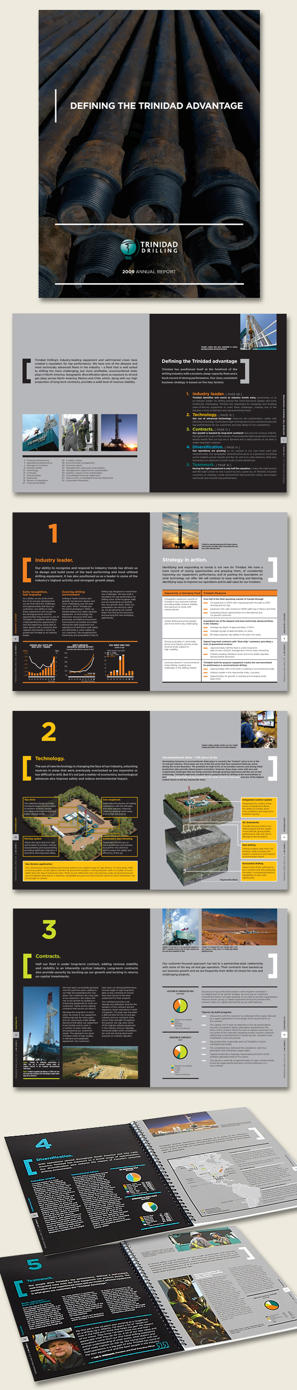
Trinidad Drilling 2009 Annual Report. Despite the somewhat dry information, this AR was a lot of fun to design! The client embraced the concept and wrote to it. It was a huge departure from what they had done in the past and was a great communication success overall. http://www.trinidaddrilling.com
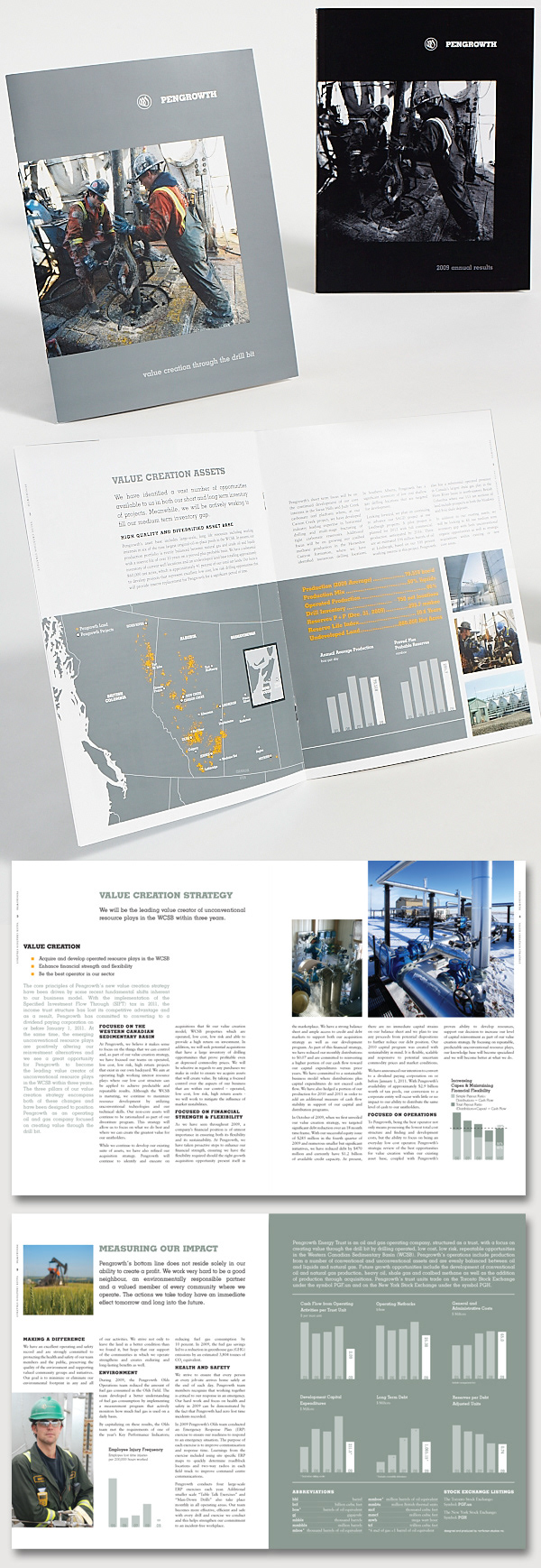
Pengrowth 2009 Annual Report. This spit-book had to be impactful, bright, and a total departure from the blue-green-gold ARs previously created. New CEO, new vision, new energy drove the design. Slab serif, slate grey, stepped layout gave the company a confident and modern voice. http://www.pengrowth.com
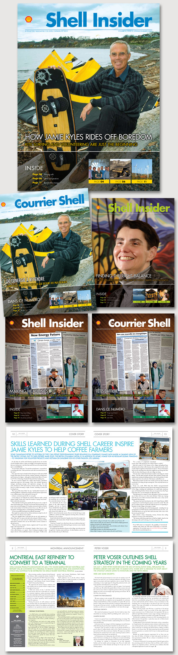
The SHELL INSIDER (Le Courrier Shell - en français) was a quarterly publication for the Shell retirees. Large format, with large type, made these concept-to-production projects a challenge to fit all the copy in... and then, there were the french counterpart versions, with 25% more text after translation!.. needless to say, condensed type was called in to the rescue! Fresh colour palette (brand standards in effect here!) was different for every issue, a fun editorial-style layout, the client (and editor Bob Blakey) gave me a lot of creative freedom to play with the layout and search for maps/stock solutions.
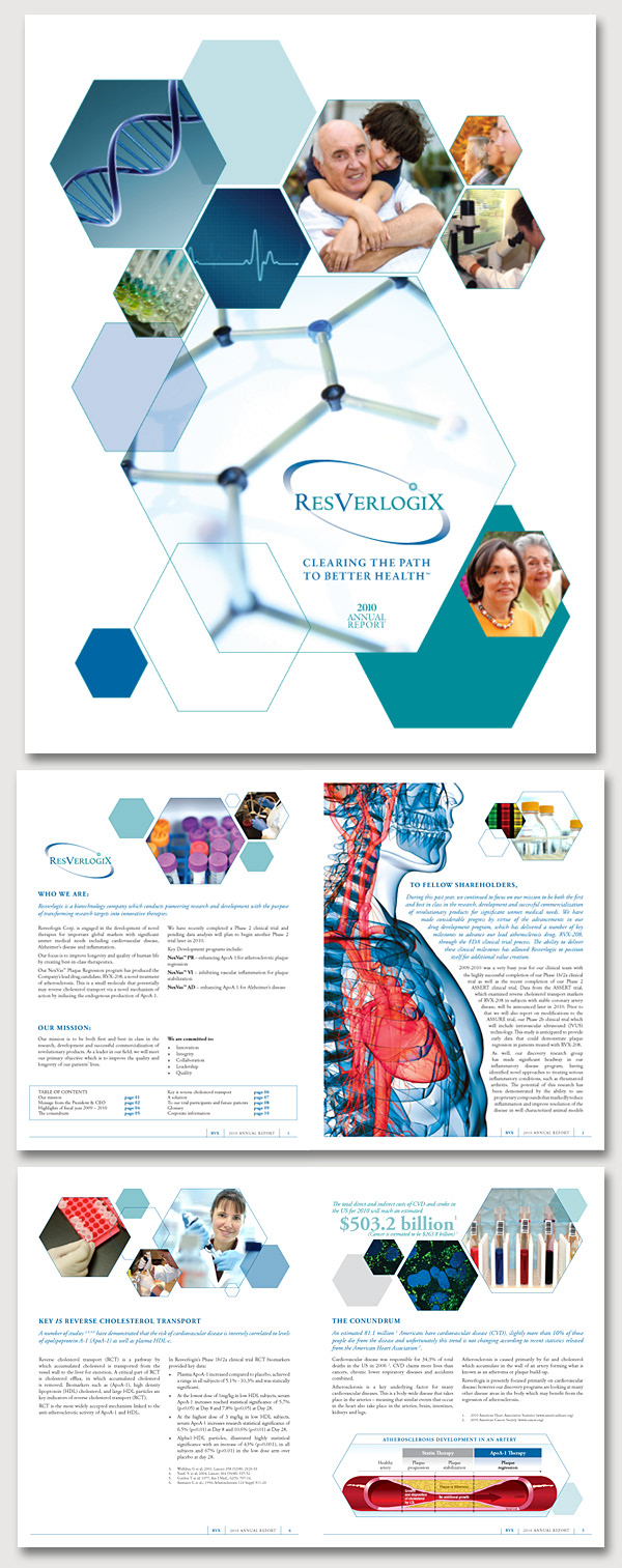
ResVerLogix 2010 AR. A small, fun, biotech-feel AR, with a slew of stock images and a handful of their own! I created the medical illustration/infographic of the cut-out of an artery, out of necessity.
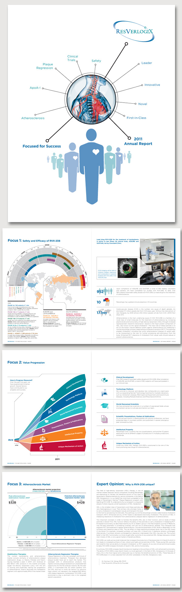
ResVerLogix 2011 AR. Another year, another infographic! Except that the information provided for these ones was so complex to synthesize and explain visually, it took me several trial and errors until I got it right. Client was so thrilled, they asked for the graphics prior to publication, to use in their investors' presentations.